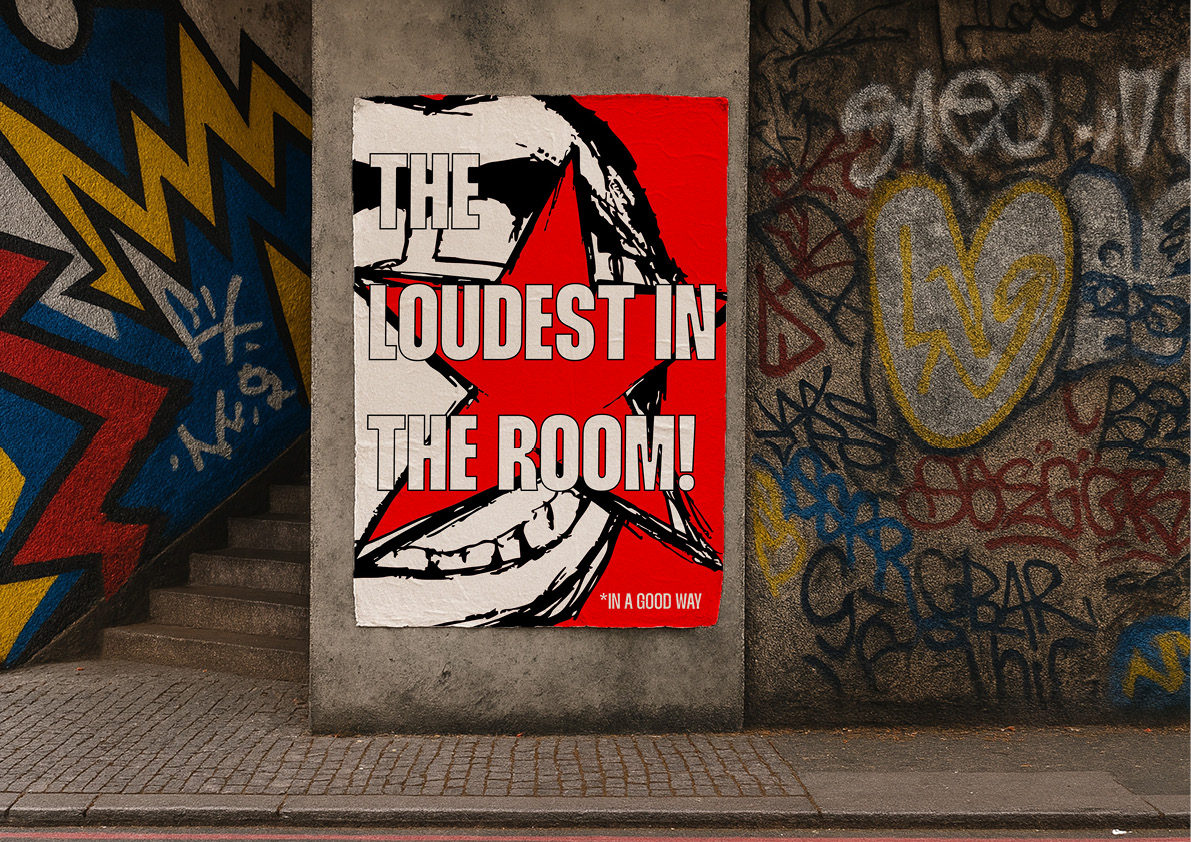
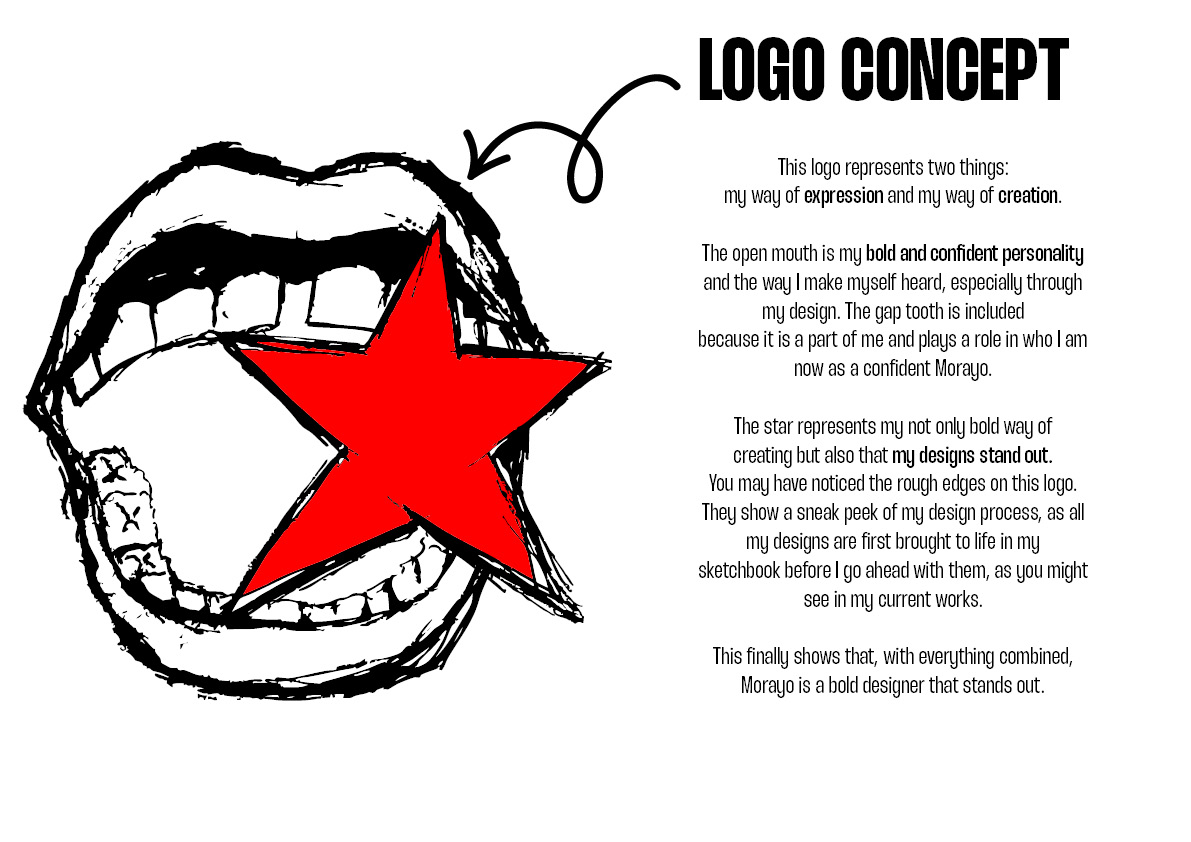
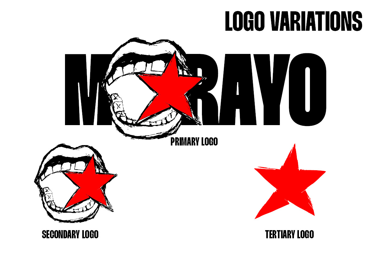
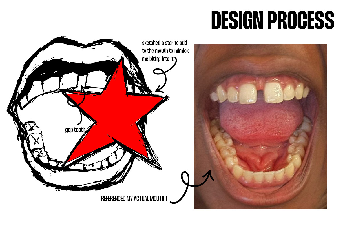
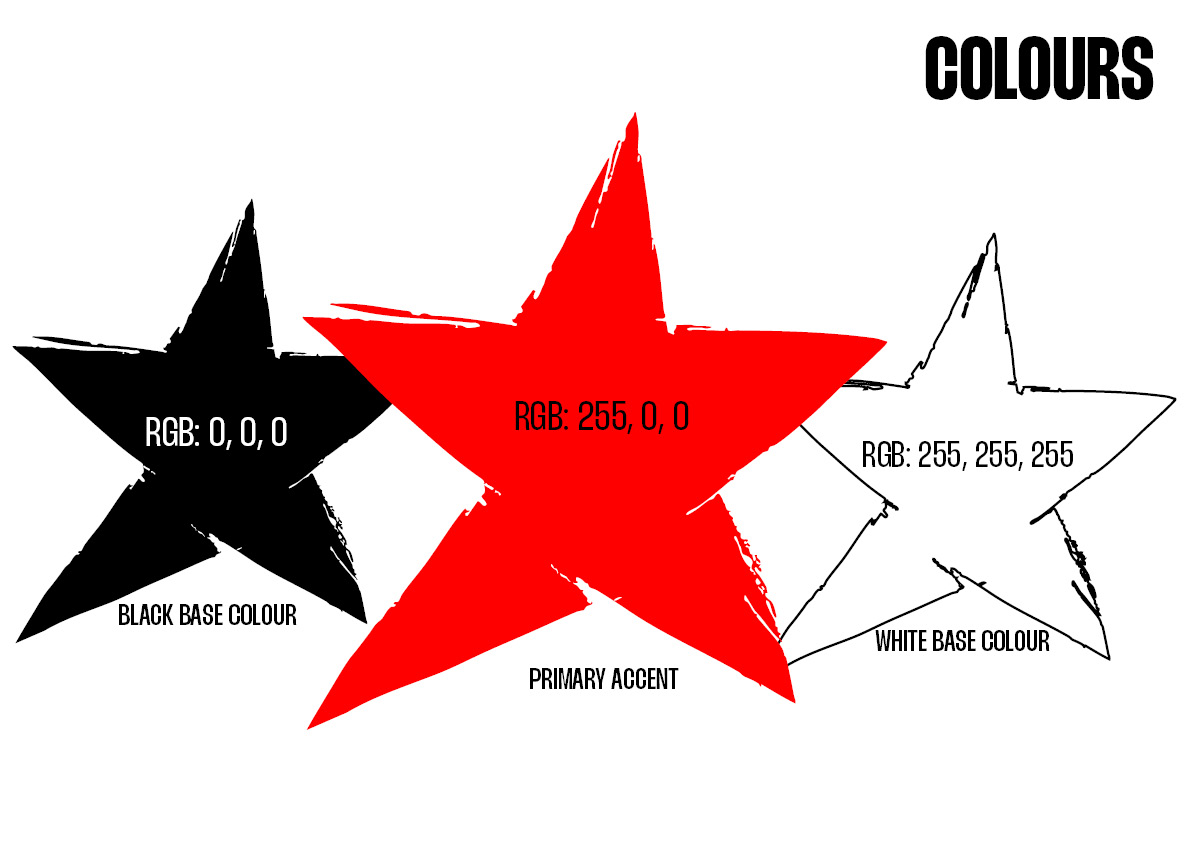
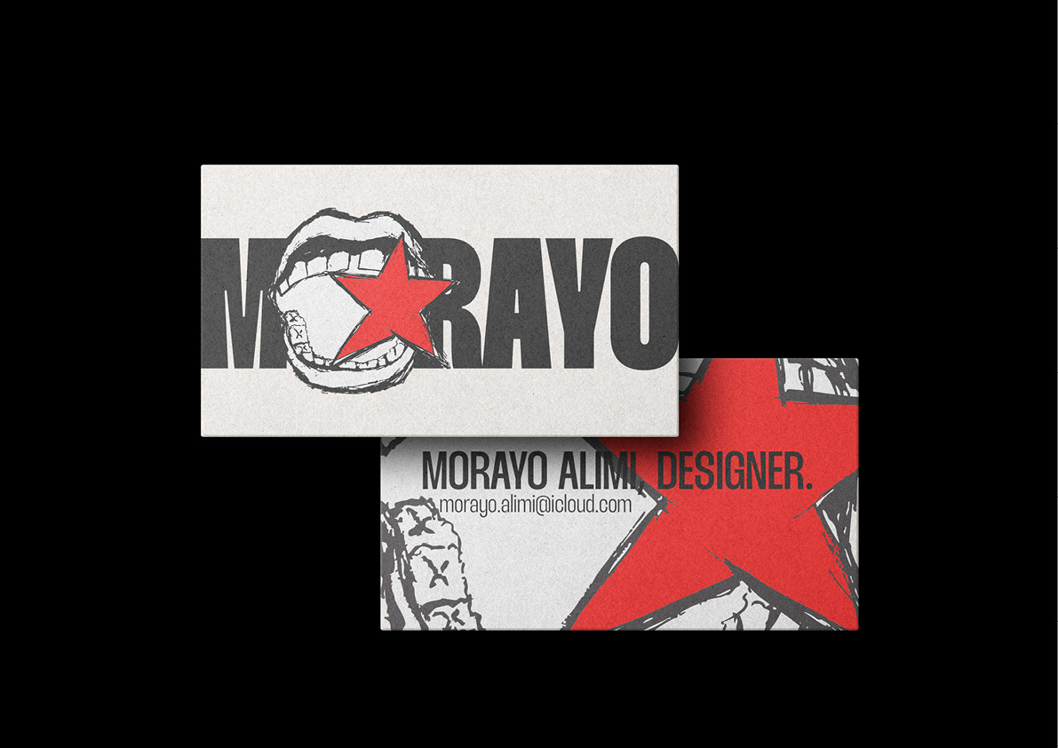
This personal branding project was a challenging project, mainly because I had to look into myself rather than look on Behance or Cosmos for inspiration. On this journey, I discovered my design traits and how they show in my various designs, and I put that into a brand concept. I used my own mouth as a reference for the logo sketch because it is my primary source of communication, and I personally am a bold person when it comes to expression, especially in design, so it fit perfectly. The bright red star represents my boldness in my design aspect, as they stand out when it comes to colors, font usage, and composition. The colors used in this brand concept were intentional, as the bright red star on a black-and-white surface shows how one, (myself) stands out in a room.

Morayo!."